|
Barry's
Tire
Tech This is a series of articles on the technical aspects of tires, their care and usage. My primary purpose in these articles is to help people understand tires and thereby reduce the risks we all face every day. ..........and since tires is just about the only thing I know about.......... Please drop me a note if you have a topic you want to see: Barry@BarrysTireTech.com |
|
Why the Endurance Tire Return Pattern didn't change: In the article on weather cracking and tire aging - here! - I stated I couldn't figure out why the tire return pattern didn't change - it should have changed timing and shifted to a later return pattern, indicating the failures were occurring later in life. Instead, it only dropped in magnitude. I now have an explanation. This article is here to allow me to explain it - mostly to myself! I am not going to be very rigorous here. And I am going to use the shape of the graphs to explain an otherwise complex math problem. |
|
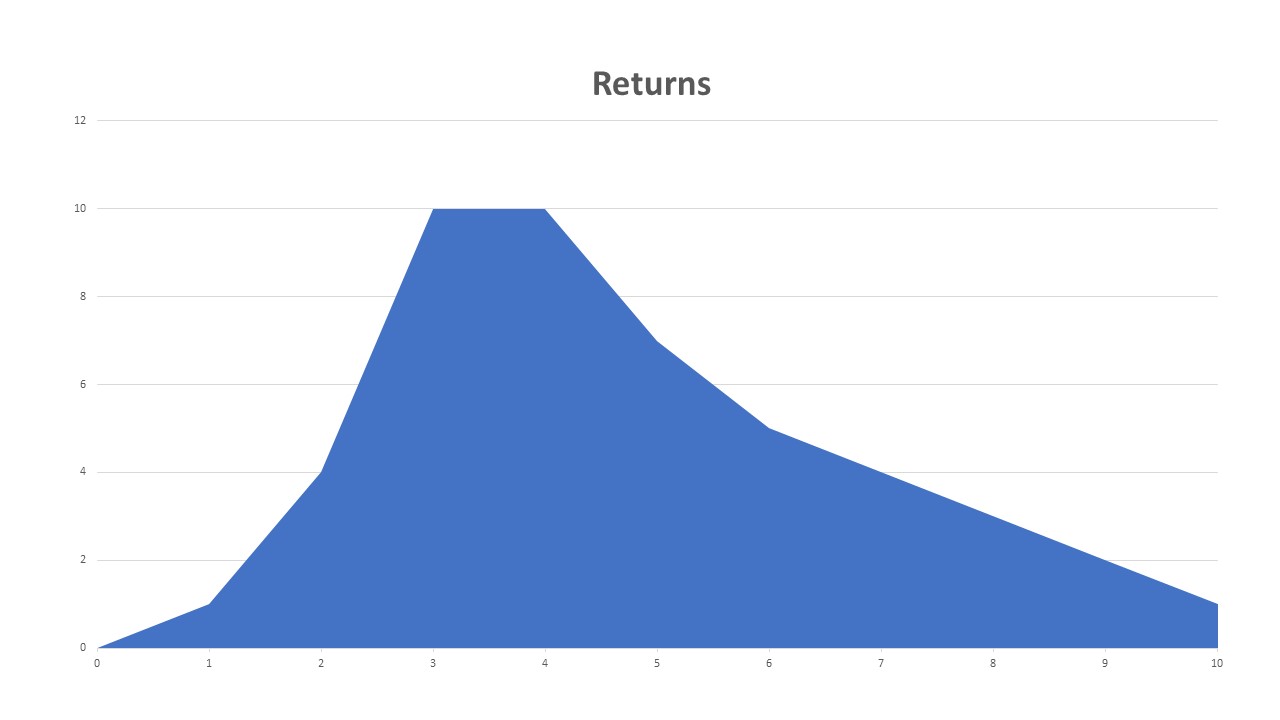
The Pattern: To the right is what the return pattern looked like: There were, of course, no returns at the beginning, and increased returns until they peaked, then tapered off as time went on. I recognized this shape as a Weibull Distribution. The shape of the pattern was the same year after year. The only difference was how high the peak was, not when it occurred! This was very puzzling to me. I would have expected that any improvements we made would shift the graph to the right as well as get a smaller peak value. That is not what happened. |
|
|
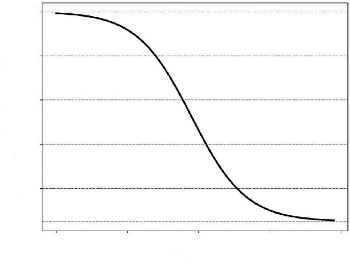
Much later, when I was writing my webpage on tire aging and weather cracking, I remembered the problem. By then I had written about the HUGE!! Firestone /Explorer situation - and part of that included an analysis of the return pattern of the Firestone tires. When doing research, I read a lot of reports on the subject. Some of those reports didn't look at the data the same way I did, but those analyses contained a very important element - that the returns were a function of how large the population was at the time of the failure. To the left is a graph that shows how the population of tires changes over time. It's called an "Inverse S Curve". Notice that the population slowly decreases at first, then accelerates, followed by a decelerated rate, ending with a tapering off. |
|
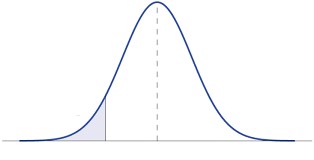
At the same time, I recognized I was dealing with the "tail of the curve". That's the part of a normal distribution either at the beginning or the end! (shaded area) What is of particular interest is if I change when the peak occurs, the tail of the curve doesn't change shape much.
An important point to consider is that when I talk about tire failures, I think the question is "when" - not a question of "if". And what we experience is that the vast majority of tires get removed from service due to their being worn out - that is BEFORE the failure can occur! And, of course, that's what we want! |
|
|
In Conclusion: I think I've figured out how this works: That when all of the above is combined, the return pattern would reduce as improvements are made, but the shape of the tail of the curve doesn't change enough to greatly affect what the curve of the returns looks like! But there are some issues:
Barry's Tire Tech - Main Page |